In spring 2014, a competition was held for the design of motifs for the new Norway banknote series. The purpose of the competition was to arrive at a proposal that can be the artistic basis of the new banknote series and communicate the theme “The Sea” in an appropriate manner. Eight participants were selected by a group of experts to take part in the final round of the competition.
The jury has comprised five external professionals and one member from the Norway Norges Bank. They have concluded that two proposals stand out: Ripple Effects by Enzo Finger, and Norwegian “Living Space” by The Metric System and Terje Tønnessen. Initially, Norges Bank decided that the commission would go to Enzo Finger, a graphic artist who has designed, among other things, a great deal of Norway’s stamps.
But in a surprising and unexpected reversal, Norges Bank flip-flopped and overruled its own jury’s decision. The central bank of Norway decided to award the commission to The Metric System together with the Snøhetta. Hence, Oslo-based graphic design firm The Metric System and Norwegian architecture firm Snøhetta designs will be used for the front and back of the country’s new notes respectively.
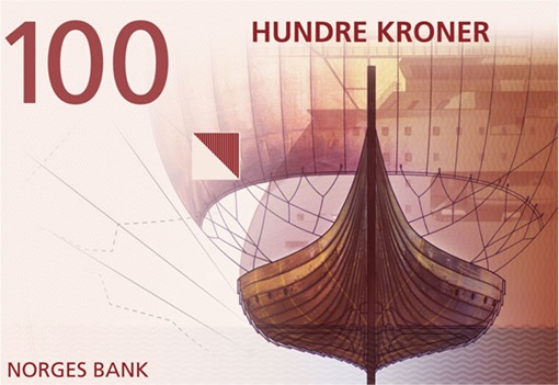
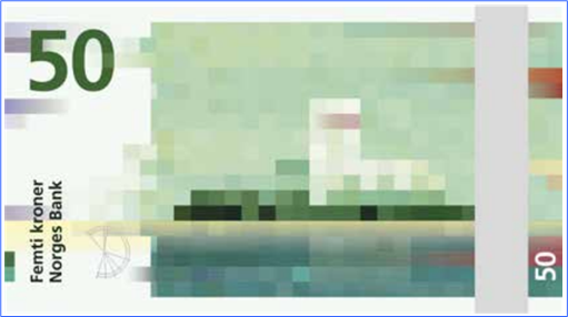
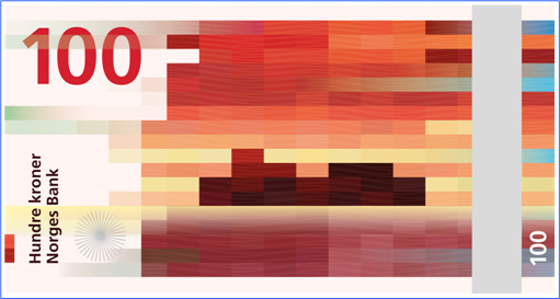
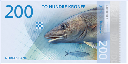
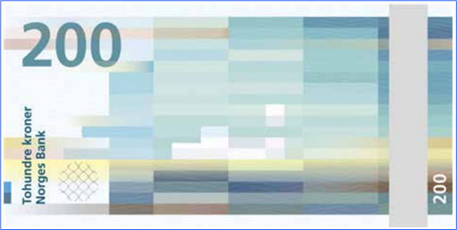
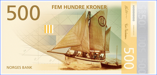
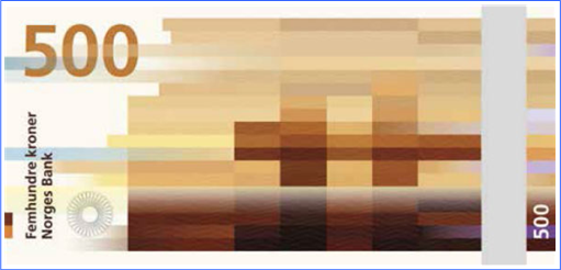
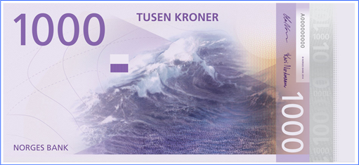
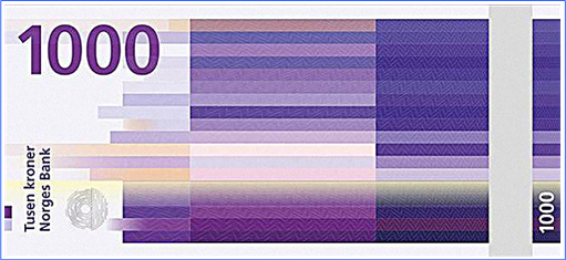
The obverse sides of the notes will be developed on the basis of the proposal from The Metric System, Norwegian Living Space. The basis of the reverse sides will be the pixel motifs submitted by Snøhetta Design, Beauty of Boundaries. While the design by The Metric System was already stunningly beautiful, what raises eyebrows is the futuristic digitally pixellated motifs by Snøhetta.
Needless to say, the combination of traditional design on the observe side and modern expression on the reverse side is simply mind-blowing. Conventional designs incorporating images traditional to Norway , such as a Viking ship, a lighthouse, a windswept sea and even a fish together with the necessary watermarks and serial numbers was nicely done. The rear side actually feature Norway’s costal landscapes, transformed into pixels.
The new banknotes, which is expected to be put into circulation in 2017 are easily the world’s best money ever designed. The 50, 100, 200, 500 and 1,000 Kroner notes are in green, maroon, blue, brown and purple colours. Simply put – the Kroner has gone Kreatif. But most importantly, Norway’s new revolutionary banknotes design has set a new world’s standard for other currencies around the world.
Other Articles That May Interest You …
- From Robbers To The Homeless, Swedes Ready For “Cash Is No Longer King”
- Here’s Proof US Govt’s Burning Money – Record High Revenues $2.66 Trillion, But Deficit $589 Billion
- Jobless And Need One Urgently? Go To Australia Now – The Land Of Jobs
- Here’s What $100 Is Actually Worth In Each State Of America
- Soros Bet $2.2 Billion On SPY Puts – Does He Know Something We Don’t?
- How To Save Money This Year – 15 Exciting Tips
- How Much Is $500 Billion, Apple’s Total Value?

|
|
October 15th, 2014 by financetwitter
|


|

|

|

|

|

|
















Comments
Add your comment now.
Leave a Reply