


Regular readers of this blog should have notice some minor changes to the design (or rather repositioning) particularly the header and the logo (if you can call it logo at the first place) which I made yesterday. The minor facelift is to improve and simplify the header in order not to clutter it. I realized there’re more that I can do to further improve it and I need time and more comments on how to make it better. Just like a car’s model, you need to have a facelift after certain period of time.
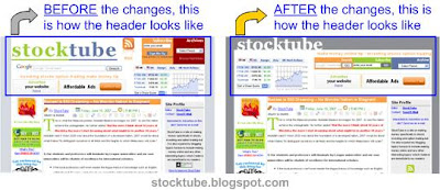 Also, please let me know if you like the current design or the previous one of which I still have a backup, so reverting is not that difficult. As a user of Google Inc.’s (Nasdaq: GOOG, stock) Blogger, it’s wise to constantly backup your posts/articles and the template.

|
|
June 17th, 2007 by financetwitter
|


|

|

|

|

|

|
Comments
thanx gabriel for your kind advice … will do something about your comment to further enhance it … appreciate your opinion …
cheers …
Hi again. Wow! It’s getting better everyday! Just a few more suggestions:
1. The logo needs to be brighter. I’ll see what I can do with it.
2. The orange header, “make money online tip – investing stocks option trading” below the logo is much better aligned with the boxes below it. Go over to your XHTML code and look for the span tag named KonaFilter. Above it will be a DIV with inline styles. Edit that DIV to this (note the semicolon and the quotation marks):
div style=”font-size:100%; align: right; padding-right: npx;”
The n in padding-right needs to have a value. Experiment with the value until it aligns left with the boxes below it.
3. Raise the Site Profile more to align with the Fuel My Blog and the Header Title alignments.
add margin: -8px 0 0 0; to
.color_navigation of your CSS code
Note the negative value for the top margin.
4. You can also try to see if the font size of your main paragraphs is much better if increased.
Add font-size: 1.03em; to
.post div of your CSS code.
These are all. Your blog is cleaner and much better than before.
hello gabriel,
thanx for your kindness again …
1) yeah, i’m still trying to get a background color which could bring the “stocktube” logo “upfront” …
2)have done that
3) have done that, but somehow css behaves differently in IE & FF … even though it’s align now for FF, in IE, it’s abit above the ruler …
4) i’ve increase the font sise for the main content to normal instead of small … i normally set it in the individual posts though … so i guess the subsequent posts would have a bigger font size …
let me know if there’re any more changes i should be aware of …
appreciate and thanx again for your kind input …
cheers


Wow! The layout is definitely less cluttered and it’s more organized than before. Good work!
I liked the color of your previous logo though. Maybe you can retain those colors.
As for the main content, it seems that it still lacked padding. I tried to remove the left and right borders of your main content and I think it looked better without them. You can try removing it yourself by going over to your CSS code and looking for the border-left and border-right attributes of #main.
Another problem would be the padding of your header titles (the ones with orange backgrounds and white texts). The texts seem to be aligned to the extreme right. A better solution to this would be to extend the width of the orange background. I don’t know how this could be done since the background is already included in the main div’s padding attributes. Anyway, this shouldn’t greatly affect your overall design.
Once again, good work!