


Why corporations spend huge amount of money in advertising? The answer is to sell their products, of course. And to do that, it depends very much on the company’s logo. The logo, to certain extend, represents company’s brand. Without a logo, you’re basically no difference from selling your products at flea market or “pasar malam” (night market). Logo is such a powerful innovation that it speaks directly with consumers.
A brilliant and well designed logo shouldn’t be too complex and must be recognisable in an instant. While some logos are straight forward, some (surprisingly) carry hidden messages or secret codes which could blow your mind. Let’s look at some of the mind-boggling corporates’ logo (there’re more out there):
{ 1 } TOBLERONE
If you go to Switzerland and never buy Toblerone, your visit is considered null and void. Period. The Swiss chocolate bar, owned by Mondelēz International, Inc, was created by Theodor Tobler (1876–1941) in Bern, Switzerland in 1908. The name “Toblerone” was derived from the creator’s name and “torrone”, an Italian word for a type of nougat. Besides its name, look closely at its logo and what do you see?
![]()
There’s a “bear” in the Matterhorn mountain, symbolizing the town of the chocolate’s origin. It was believed that the triangular shape of the Matterhorn in the Swiss Alps inspired Theodor Tobler for the triangle shape of Toblerone chocolate.
{ 2 } PITTSBURGH ZOO & PPG AQUARIUM
Opened on June 14, 1898, the Pittsburgh Zoo & PPG Aquarium is one of only six major zoo and aquarium combinations in the United States. Sitting on 77 acres (31 ha) of park land, it exhibits more than 4,000 animals representing 475 species, including 20 threatened or endangered species. Pittsburgh Zoo has one of the best logo with hidden message, or rather image.
![]()
Can you spot this – on either side of the tree, the faces of a lion and gorilla appear in white. That’s not all – can you find two fishes that seem to be jumping happily out of the water? This is obviously a great logo symbolizes a zoo with an aquarium, is it not?
{ 3 } FEDEX
If you happen to study design, chances are your lecturer would have use FedEx Corporation as a case study on the importance of using “negative space”. FedEx is an American global courier delivery services with a market capitalization of over US$47 billion (£27.6 billion, RM151.4 billion) listed on New York Stock Exchange.
![]()
Although its logo of “FedEx” has undergone numerous round of colour changes, the foundation of the syllabic abbreviation remains. Try to show FedEx logo to your kids and point to where the “arrow” is. Did they say “Whoa !!!” ?
{ 4 } AMAZON.COM
Amazon.com is the world’s largest online retailer. Started as an online bookstore, the company which was founded by Jeff Bezos has diversified to selling DVDs, MP3, electronics, video games, furniture, food, jewelry and whatnot. It even sells e-book reader Kindle and latest – Fire “smart” Phone.
![]()
Most people would think the yellow arrow icon under the Amazon.com wording to mean a merely “smile”. But in actual fact, it represents a vast amount of products that the company is offering, as in “from A to Z” – that’s the message of the yellow arrow. If you still can’t figure it, give yourself a knock on the head (*grin*).
{ 5 } BASKIN-ROBBINS
Found in 1945 by brothers-in-law Burt Baskin and Irv Robbins, Baskin-Robbins is the world’s largest chain of ice cream specialty shops. It has presence in almost 50 countries, with over 7,000 locations, including nearly 2,500 shops in the United States and over 4,600 located internationally.
![]()
While it is easy to understand how Baskin-Robbins got its name, do you also know that it’s logo has a hidden message? There’s a number “31” cleverly planted in its logo – representing its “31 flavours” slogan, an idea where customers could have “different” flavour every day of any month. Isn’t that cool?
{ 6 } MERCK
When people talk about pharmaceuticals company, who could miss Merck & Co Inc, listed on New York Stock Exchange with a market cap of over US$172 billion (£101 billion, RM554 billion)? Merck is famous for its drug, Vioxx, for treating arthritis. Nevertheless, Merck was sued and found liable for using deceptive marketing tactics to promote Vioxx and 30 states were ordered to split a $58 billion settlement.
![]()
So, what’s so exciting about the pharmaceutical company’s logo? If you haven’t realize yet, it is made up of “a capsule and two pills”. Interestingly, in a very scientific poll of people about Merck’s logo, 50% were surprised, while the other 50% said that’s the only thing that logo could possibly be.
{ 7 } WENDY’S
After 29 years, Wendy’s began using a new logo in 2013, although it still features founder Dave Thomas’s daughter as an 8-year-old happy girl. According to a survey made by Food Network UK, more than 50% of men prefer their Mom’s cooking to their own wife’s. This is not surprising as our brains learn to love and have natural sentimental value of Mom’s home-cooked meals, as we grow up.
![]()
Hence, when it was pointed out to the word “Mom” embedded in its logo, Wendy’s said they were surprised and claimed it wasn’t intentional. Still, people believed Wendy’s deliberately and secretly put the “Mom” word on Dave Thomas’s daughter ruffled collar, trying to associate Wendy’s with Mom’s cooking.
{ 8 } SUN MICROSYSTEMS
Although Sun Microsystems has cease to exist after acquisition by Oracle in 2010 for US$5.6 billion, you can’t help but admire it’s mind-boggling logo. Sun Microsystems was the big boy before the “Dot Com” burst. People in the Information Technology field will remember the era of Sun Solaris, Java, Sun Ray, Open Office and whatnot.
![]()
But the most impressive thing about Sun Microsystems is still it’s wonderful logo which showcase the greatness of symmetry and order. The letters “u” and “n” were brilliantly arranged adjacent to each other to look like the letter “S”, and in any particular direction the word “SUN” is formed.
{ 9 } STARBUCKS
Think of coffee and think of Starbucks. Founded in 1971, this Seattle-based coffeehouse chain is the largest coffeehouse company in the world – 23,187 stores in 64 countries, including 12,973 in the United States, 1,897 in China, 1,550 in Canada, 1,088 in Japan and 927 in the United Kingdom. Surprisingly, the company was named after a character in the novel Moby Dick.
![]()
The Starbucks logo that we know today is based on 15th Century artwork, which includes a topless Greek mermaid with two tails. Of course, the original logo which had the breast visible is now covered by the mermaid’s wavy hair. On the modern logo the two tails can be seen and the mermaids arms reaching to grab them.
{ 10 } HERSHEY’S KISSES
Hershey’s Kisses is one of the most popular brands of candies in the United States. Manufactured by Hershey Company, Hershey’s Kisses is well-known for its distinctive shape – looks like a tear-drop. The chocolates are wrapped in squares of lightweight aluminium foil with a narrow strip of paper protruding from the top, making it premium-like and as if the strip of paper contains a secret message.
![]()
The Hershey’s logo looks very simple, but when you look closer you’ll notice it plays cleverly of the negative space between the “K” and “I”, just like “FedEx” logo, to create the illusion of a kiss chocolate.
{ 11 } THE TOUR DE FRANCE
Tour de France 2014 is made up of 21 stages and will cover a total distance of 3,664 kilometres covering 9 cities – Leeds, Harrogate, York, Sheffield, Cambridge, Ypres, Oyonnax, Risoul, Maubourguet Pays du Val d’Adour. The stages involve 9 flat hills, 5 hill stages, 6 mountain stages with 5 altitute finishes, 1 individual time-trial stage and 2 rest days.
![]()
This de tour is interesting because of its eye-catching logo. If you still couldn’t figure it out, the Tour de France logo actually contains the image of a cyclist which can be seen in the letter ‘R’, with the orange circle symbolizing the front tire.
{ 12 } NBC TV NETWORK
Founded in 1926, The National Broadcasting Company or popularly known as NBC is an American commercial broadcast television and radio network. Needless to day, this is the oldest broadcast network in the United States. NBC is sometimes known as the “Peacock Network”, due to its unique logo.
![]()
NBC logo has a peacock in white with five colourful feathers representing each division of NBC (when the logo was originally designed, as there are more now). The peacock is also looking to the right (noticed it in the purple feather?), often associated with looking ahead or forward – an auspicious sign indeed.
{ 13 } VAIO
Vaio, stands for “Visual Audio Intelligent Organizer” was the personal computer division of Sony Corp. The first generation of Vaio laptop computers was released in 1997 but due to sluggish sales, Sony announced in Feb 2014 the sale of its VAIO PC business to Japan Industrial Partners (JIP). Vaio has one of the distinctive logo in the PC business.
![]()
At first glance, the logo looks like a modern typography. But there’s a hidden secret meaning of Sony’s VAIO logo. The first two letters was designed in such a way to represent an analog signal which the last two letters are “1” and “0”, the binary representative of bit and bytes of the digital world.
{ 14 } LG Corp
LG Corporation (Korean: LG 법인), formely Lucky Goldstar, is a South Korean multinational conglomerate corporation – the fourth-largest chaebol in South Korea, to be precise. LG Corporation is today a holding company that operates worldwide through more than 30 companies, covering businesses in the electronics, chemical, medicines, televisions, mobile phones and whatnot.
![]()
LG says the letters “L” and “G” in a circle symbolize the world, future, youth, humanity, and technology. The LG logo in LG Grey and the stylized image of a human face in the unique LG Red color looks delightful though not very “professional”. Hence rumour has it that if you rotate LG logo to certain degrees, you’ll see a hidden “Pac-Man” (*grin*).
{ 15 } EIGHTY-20
Eighty-20 is a niche small consulting company based in South Africa. Their main product is the Consumer Information Portal that enables clients to easily access relevant market research data. Eighty-20 consulting got its name from a 80:20 rule, a rule otherwise known as Pareto Principles observed by Italian Vilfredo Pareto who said that in Italy, 80% of the land was owned by 20% of the population.
![]() Eighty-20 logo consists of squares representing binary code. There’re two lines of such squares. If you’ve studied Computer Science, you would be able to decipher the codes – the top line 1010000 and the lower line 0010100 – represents 80 and 20 respectively, of course.
Eighty-20 logo consists of squares representing binary code. There’re two lines of such squares. If you’ve studied Computer Science, you would be able to decipher the codes – the top line 1010000 and the lower line 0010100 – represents 80 and 20 respectively, of course.
{ 16 } FORMULA-1
You don’t need much introduction on the type of business that Formula-1 is running. Known as short-form F1, Formula 1 is the highest class of single-seater automobile racing sanctioned by the Fédération Internationale de l’Automobile (FIA). The “formula” basically means a set of rules with which all participants’ cars must comply.
![]()
At first glance, you can only see “F” and wonder where could the “1” be. Again, just like “FedEx”, the “1” is hidden between the letter “F” and the speed red-lines. This logo is not too tricky but need some seconds to figure it out. Still, it’s a simple yet recognisable logo around the world.
{ 17 } CARREFOUR
Many pronounce this French retailer as “Car Four” but in actual fact, it should be promounced as “Ca-Foo”. You can pronounce it as “Car-Fool” if you like (*grin*) but it won’t change the fact that Carrefour is the fourth largest retail group in the world in terms of revenue and the third in profit.
![]()
In French, Carrefour means “Crossroads”. Its logo actually symbolizes this word through two opposite arrows. And if you care to look closely, you’ll see the huge letter “C” in the negative space between these two arrows.
{ 18 } UNILEVER
Unilever needs no introduction. One of the oldest multinational companies, it is the world’s third-largest consumer goods company measured by 2012 revenue, after Procter & Gamble and Nestlé. Unilever was founded in 1929 by the merger of the British soapmaker Lever Brothers and the Dutch margarine producer Margarine Unie. Unilever has a market capitalization of over US$125 billion.
![]()
Unilever has over 400 brands and thousands of products, so much so that its logo has a huge “U” shape composed of 24 icons woven together. I bet my last penny that nobody actually counts it. Each of this smaller icon represents one of the company’s sub-brands.
{ 19 } GOODWILL
Founded in 1902, Goodwill is a non-profit organization that helps disadvantaged people in the United States and Canada. It offers customized training and services for people who want to find a job, pursue education or simply to solve financial problems. It receives grants from government, corporation and anybody who wishes to donate.
![]()
It’s logo is closely related to the organization’s initiative – a letter “G” is a smiling face – to mean happiness and relief provided by Goodwill to those in need.
{ 20 } PICASA
Google acquired Picasa and made it free. Picasa is an image organizer and viewer specifically for organizing and edting digital photos. If you didn’t know, “Picasa” is actually a blend of the name of Spanish painter Pablo Picasso, the phrase mi casa (Spanish for “my house”) and “pic” for pictures (personalized art).
![]()
Hence, Picasa logo reflects the concept of a home for your pictures. The logo consists of five different colour of a camera shutter. The multiple colours here mean the colourful photos captured for your viewing pleasure. and inside the coloured camera shutter, there is a “house” – completing the meaning of “Picasa” in Spanish.
{ 21 } NINTENDO GAMECUBE
Nintendo, the same associated with games, released its 6th-generation GameCube in Japan and North America in 2001. Competing directly with Sony’s Playstation 2 and Microsoft’s Xbox, 22 million units of GameCube were sold worldwide before being discontinued in 2007. It’s replacement – Wii.
![]()
Nintendo’s GameCube logo is one of the most cleverly designed. It was all about combining “Game” and “Cube”. There’s a cube within a cube which shows the letter “G” enclosing a letter “C” in negative space. A fantastic design which should be part of case-study for design school.
{ 22 } UNITED STATES CYBER COMMAND
Tons of people didn’t realize the revelation of United States Cyber Command by the Pentagon. Known in short as USCYBERCOM, this new military command was launched to help centralize Defence Department efforts to protect its computer network. But what raises eyebrows were its logo, which has a string of hidden codes, without which will be like a lot of other government and military seals, depicting an American eagle, stars and the globe.
![]()
The secret code is in the inner gold ring of the logo. The text-code “9ec4c12949a4f31474f299058ce2b22a”, which is located in the command’s emblem, is the MD5 hash of their mission statement. Still, you need to decipher it to know the meaning. Okay, here’s the hint – it has to do with their mission. Or could it be a distress signal to activate “Transformers”?
{ 23 } JELLY INDUSTRIES
Christopher Isaac Stone is a co-founder of Twitter who also happens to be the same person helped in creating and launching Xanga, Blogger, Odeo and Jelly Industries. Jelly is an iOS and Android app that serves as a Q&A platform, similar to Quora and ChaCha, but is using image to ask questions.
![]()
Christopher was such a brilliant person he’s also known as “Biz Stone”. So, it wasn’t a surprise that his Jelly Industries logo resembles his intelligence. Not only the logo looks like a jellyfish, it’s also a brain. A simple yet a powerful illustration of what a logo can represent.
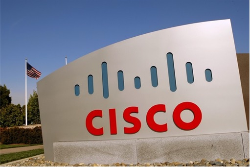
{ 24 } CISCO SYSTEMS
Cisco is the leader in networking equipment – designs, manufactures and sells networking equipment who commands a market capitalization of over US$127 billion. There was a tale how Huawei China gets to the market – they bought Cisco equipments, took everything apart, study and analyse it, and did a reverse-engineering to create Huawei’s own version of networking equipment.
![]()
Networking engineers may know the meaning of Cisco logo – it represents digital signals, which happen to be associated with Cisco’s wide range of products. But do you know that it also intended to depict the two towers of the infamous Golden Gate Bridge? After all, Cisco was founded in San Francisco, California.
{ 25 } APPLE
Talk about Apple and the first thing that comes to mind is iPhone, the first smartphone which revolutionize social networking. And we always associate Steve Jobs as the Einstein of this century. Apple carries such a premium products that its “apple” logo represents luxury.
![]()
The Apple logo is derived from the story of Adam and Eve in the Bible. The bite in the apple symbolizes the apple from the Garden Of Eden. When Eve, took a bite out of the apple, she gained knowledge of good and evil. Hence the Apple logo says – you can use all their products for good or bad. There’s another meaning though – the bite was deliberate done to differentiate apple from other fruits such as cherry. It would be disastrous if your kids keep arguing it’s a “Cherry” and not an “Apple”, no?
Other Articles That May Interest You …
- Beware! Here’s How Government’s Spying On You, Legally
- Rebuild Teeth With £10 Toothpaste, Here’s The Catch …
- Top 15 Creative, Stunning, Cool & Useful Business Cards
- American Top-20 Best Burger That You Must Try
- Here’re 11 Amazing Hidden Messages On Dollar Bills
- Debts & Deficits – 21 Currencies That Have Gone Bust
- 10 Most Expensive US Military Vehicles You May Not Know

|
|
June 23rd, 2014 by financetwitter
|

|

|

|

|

|

|


Excellent article. I became looking at continually this website for encouraged! Beneficial facts specially the remainder area 🙂 I personally cope with this kind of information and facts considerably. I became in search of this kind of data for your while. Many thanks and also all the best !.